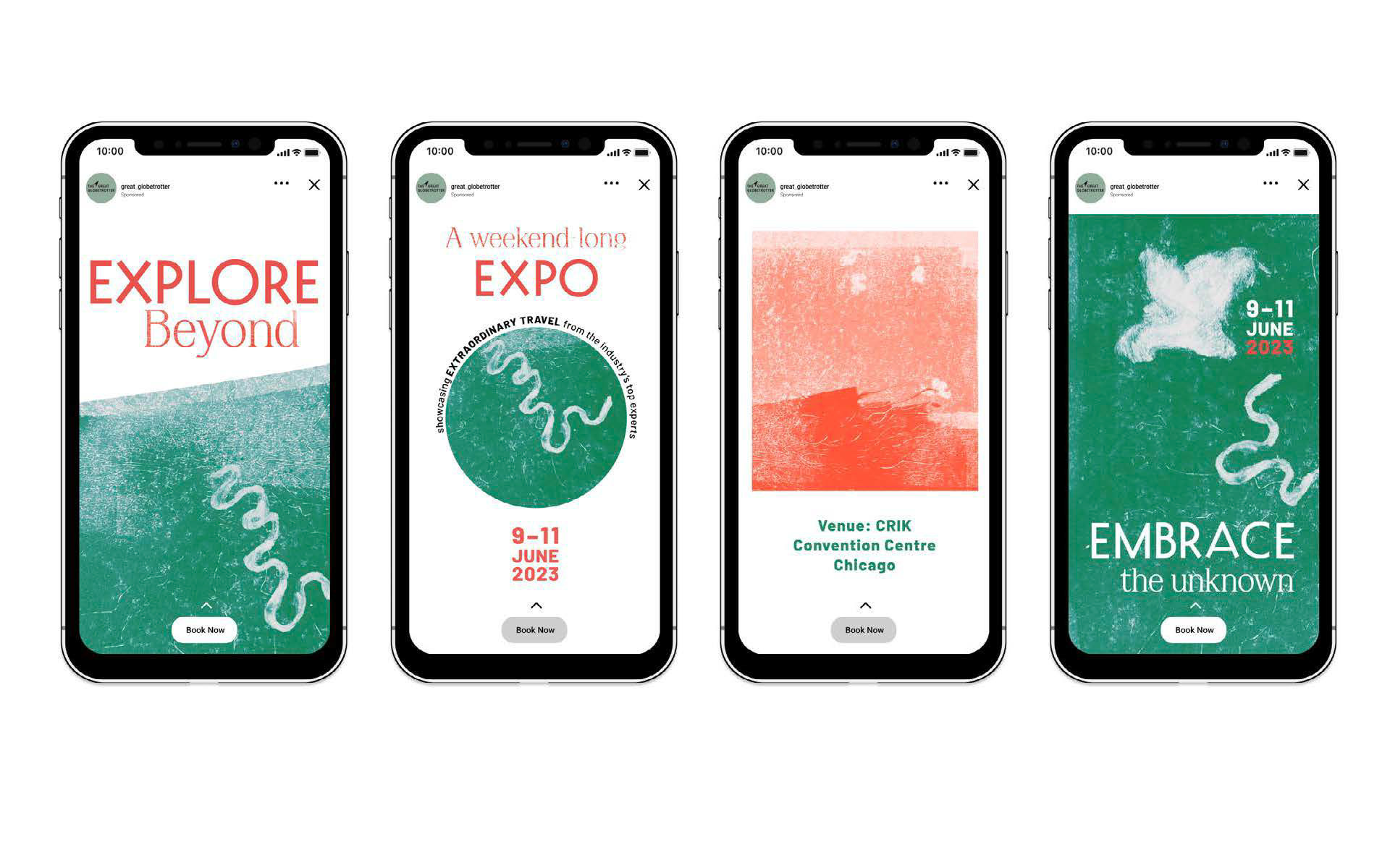
A flexible brand identity for a large travel fair wanting to showcase sustainable credentials without becoming cliché.; to be rolled out across print and digital.
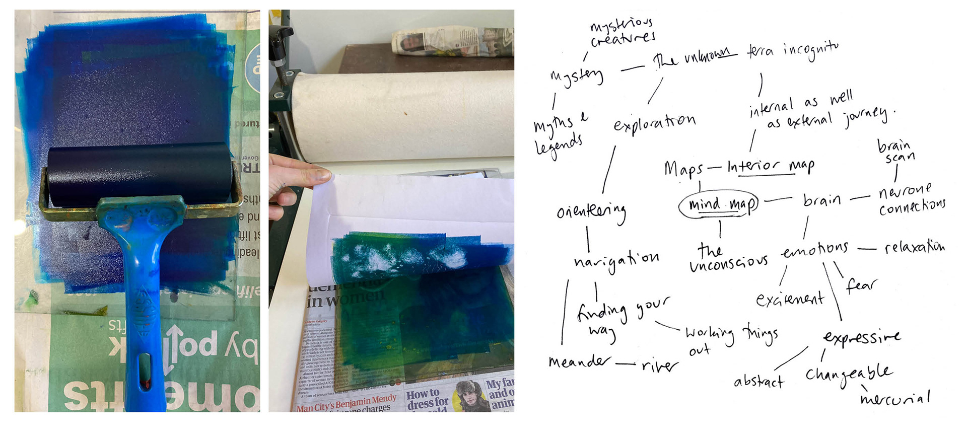
I looked at how maps can be both a physical record of a trip as well as an imprint or palimpsest of memories from that trip. These “memory maps” also incorporate the idea of slow travel: a kind of travel that encourages us to reflect and delve deeper into our own minds. Visual keywords that come to mind are: expressive, mysterious and ephemeral.
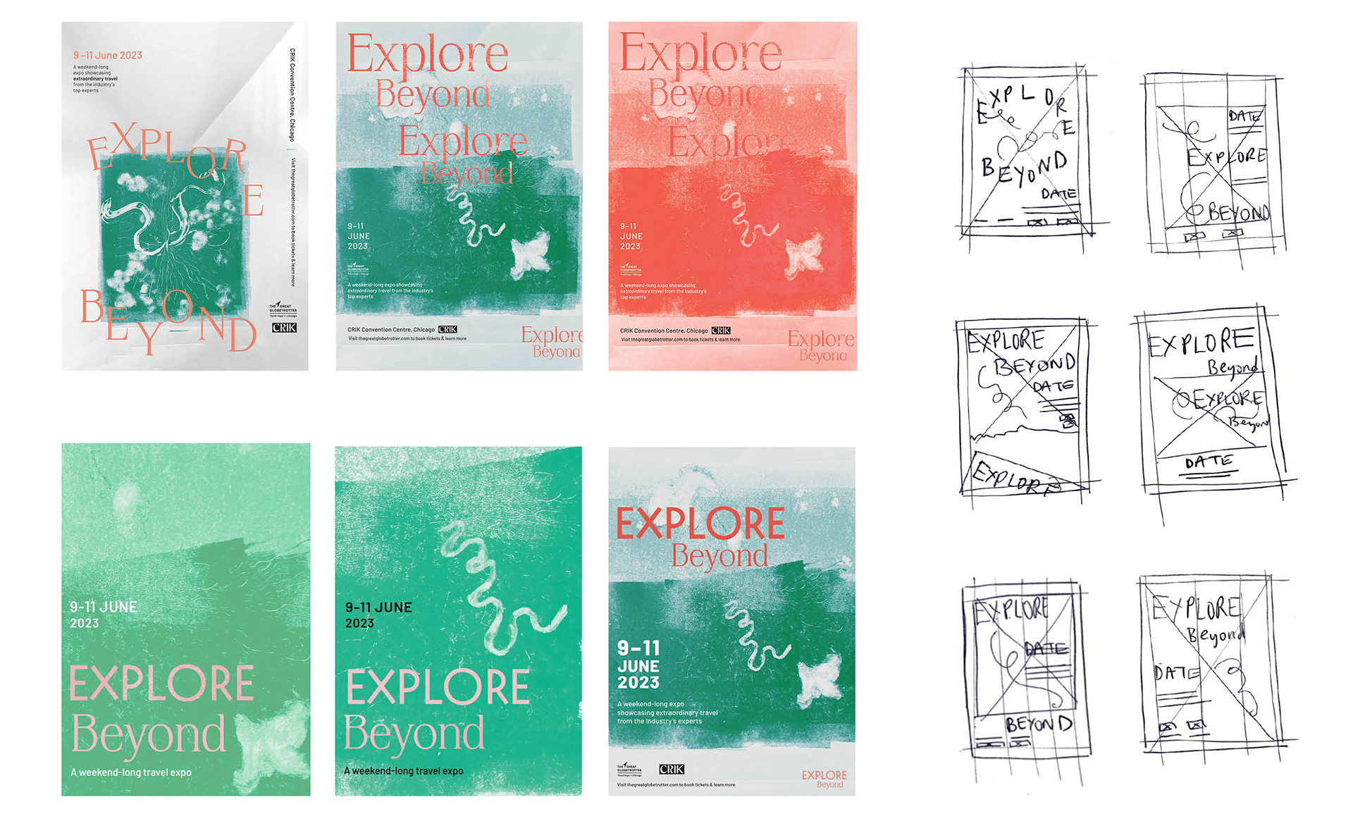
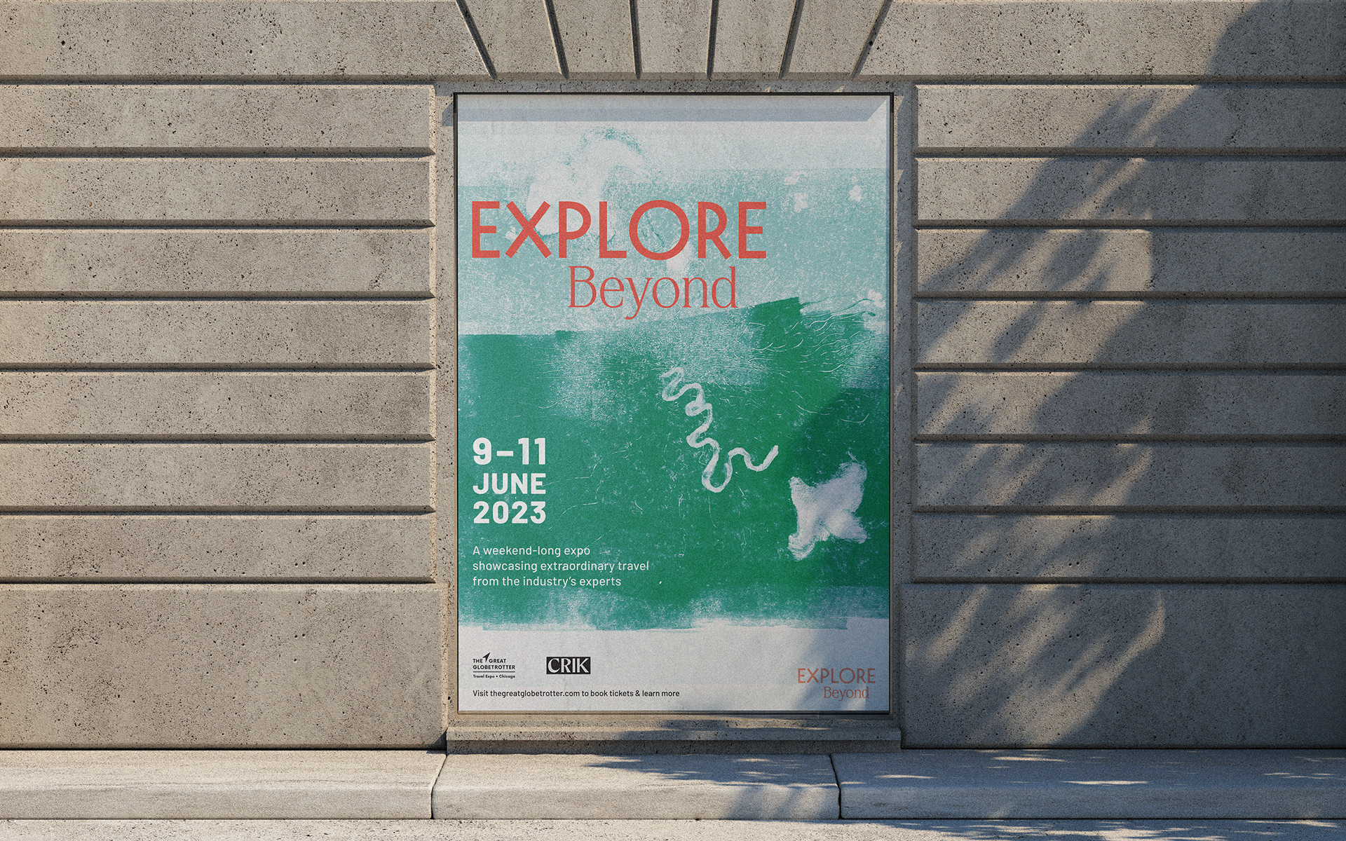
To explore this, I experimented with mono-printing – a one-off printmaking process which aptly reflected the elusive, intangibility of memories. The type lockup, is a slimline serif font, Krylon paired with Decovar – chosen for its expansive ‘O’ and ‘X’. The colour scheme is emerald green to reflect nature, complimented with an orange-red for impact.